What is your first impression of my new logo?
Though amateurish, I put it together to depict my blogging site, rather than using my picture, for privacy and professionalism. I hope in your opinion that I achieved this.
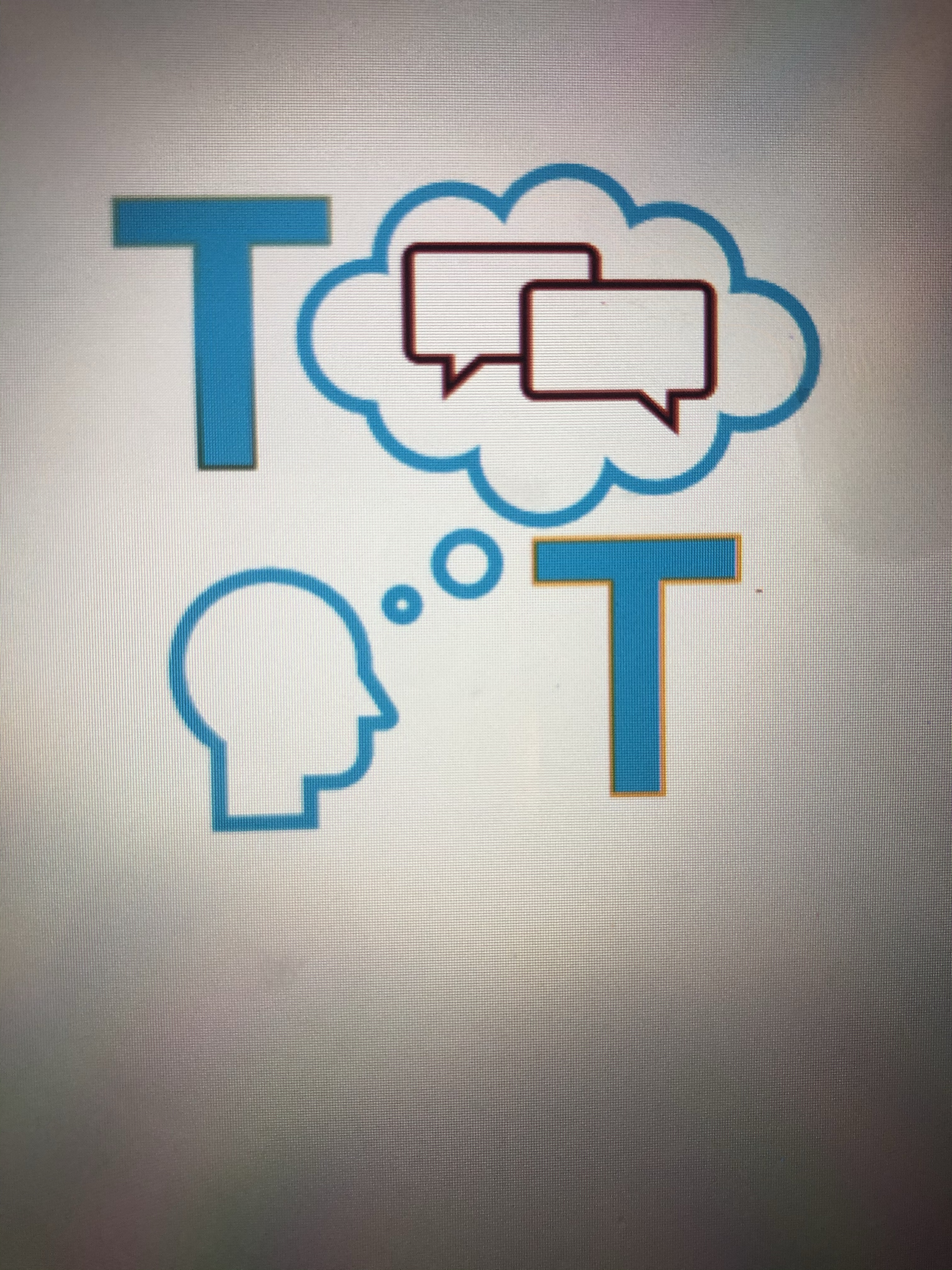
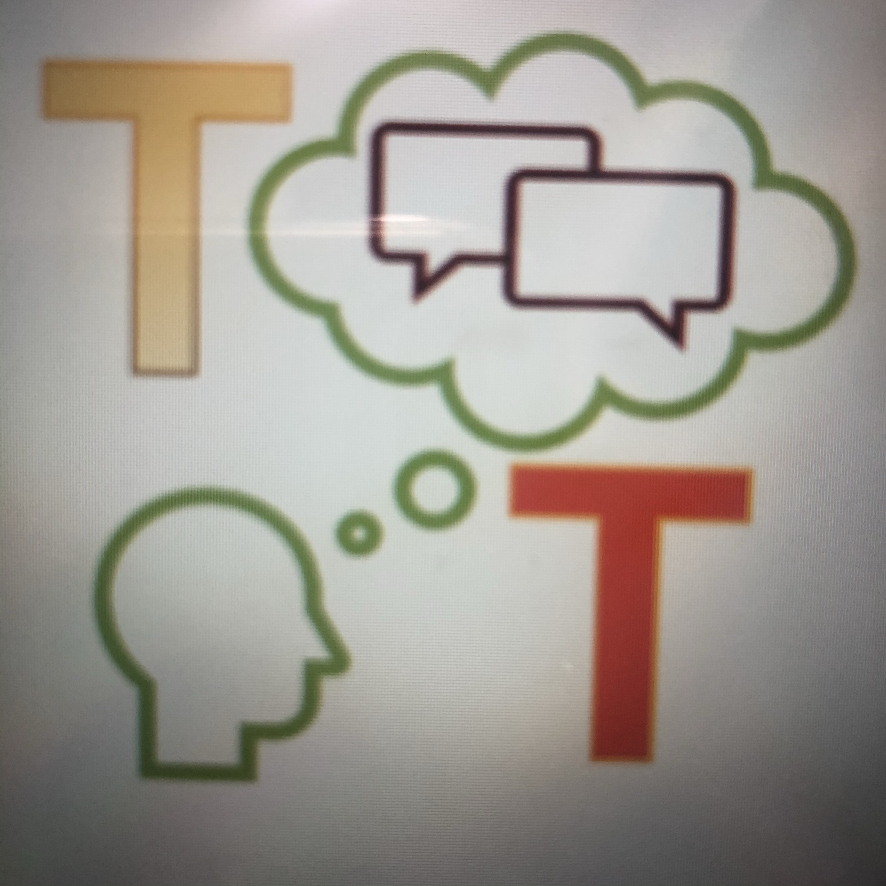
Do you like the one color or, like I first created it, with multiple colors but my daughter recommended the one color saying that it’s more modern! Another way of telling me that “I’m getting old,” right?! 😂 Here’s my initial creation:
Also, would a background color accentuate the logo? If so, what color would you recommend?
Thanks for your input … all suggestions would be considered.
Vote here:
✌🏽❤️

Engr.V,
Thank you most sincerely. I appreciate your comments – worth much more than two cents to me.
I agree that Logo #2 matches my website, and Logo #1 is simple. My daughter said that “it’s modern.”
LikeLike
I like the layout and the image! I see that the only thing that differs is the color but it seemed to differ significantly in vibe. Personally, I prefer the first logo because I like to keep it simple. But when I visited your site (reading from the Reader at first) to check the correlation of the logo and the theme, I figured that the second logo suits the site better. Just my two cents though! 🙂
LikeLiked by 1 person